
Custom Components & Component Libraries


- Getting started with Microsoft Power Platform
- Understanding the Panes in Power Apps: A Beginner-Friendly Guide
- PowerApps: Global Variables, Context Variables and Collections
- Building an Expense App with PowerApps and SharePoint
- Gallery and DataTable
- Navigation, add, update & delete
- Custom Components & Component Libraries (current)
- Building a Smarter Expense App: Direct Email Approvals without Flow
- Protecting Admin Screens in Power Apps
- Publish your App
Power Apps: Custom Components & Component Libraries
Overview
Custom Components in Power Apps enable the creation of reusable UI elements such as headers, footers, navigation menus, modals, and more. When organized in a Component Library, these elements can be shared across multiple apps, ensuring design consistency and maintainability.
Why Use Component Libraries?
-
Reusability: Use components across many apps without rebuilding.
-
Consistency: Maintain a unified UI/UX across all your Power Apps.
-
Configurability: Use custom properties for dynamic behavior.
-
Maintainability: Update once, use everywhere.
Recommended Component Structure
Example Shared Components
| Component | Purpose |
|---|---|
cmp_Header |
Title bar with logo and back button |
cmp_Footer |
Footer text or quick links |
cmp_SideMenu |
Navigation drawer or menu panel |
cmp_Spinner |
Loading animation |
cmp_Toast |
Temporary alert/message system |
1. Create a Component Library App
-
Navigate to Apps > Components > New Component
-
Name it clearly, e.g.,
UI_Components_Library
2. Use Clear Naming Conventions
-
cmp_prefix for components:cmp_Header,cmp_NavMenu -
Group similar components by name:
cmp_TabUser,cmp_TabAdmin
Example: Custom Components & UI_Components_Library
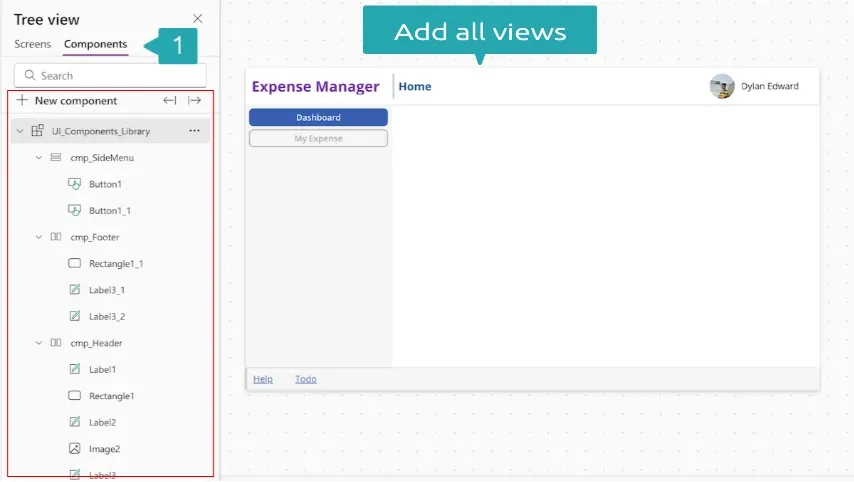
This article outlines the structure and use of a shared component library named UI_Components_Library in Power Apps. It provides reusable UI elements like headers, footers, and side menus for consistent and scalable app development.
Library Structure (Based on Current Screenshot)
Component Library Name: UI_Components_Library
Components Included
| Component | Description |
|---|---|
cmp_SideMenu |
Vertical navigation menu with two buttons: Dashboard , My Expense |
cmp_Footer |
Footer with help and task links, includes rectangle and labels |
cmp_Header |
Top bar with app title ("Expense Manager"), user name ("Dylan Edward"), and avatar |
Component Details
📋 cmp_SideMenu
-
Controls:
Button1,Button1_1 -
Purpose: Navigation menu for screen switching
📋 cmp_Header
-
Controls:
Label1,Label2,Label3,Image2,Rectangle1 -
Purpose: Header with branding, current screen, and user info
-
Suggested Properties:
-
Title (Text)– e.g., “Expense Manager” -
UserName (Text)– e.g., “Dylan Edward” -
UserImage (Media/Image)– bound to profile photo
-
📋 cmp_Footer
-
Controls:
Rectangle1_1,Label3_1,Label3_2 -
Purpose: Bottom bar with links like “Help”, “Todo”
-
Suggested Properties:
-
HelpLink (Text or Action) -
TodoLink (Text or Action)
-
Creating Custom Events in Power Apps Components
Custom events let you raise actions from a component (like a button click) to the app-level logic.
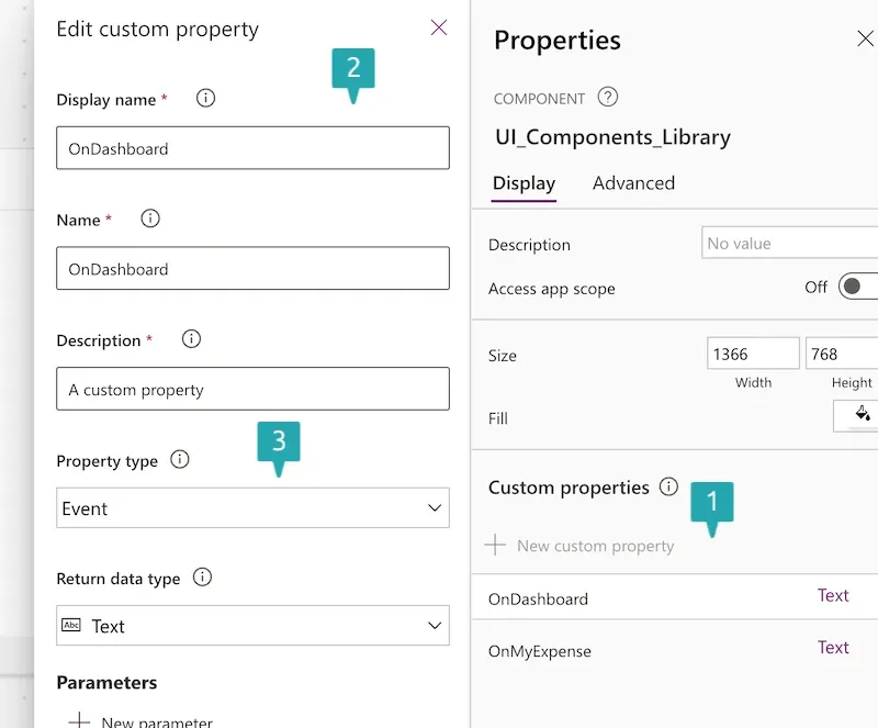
🔨 Step-by-Step: Create a Custom Event
1. Define a Custom Property in the Component
-
Go to the Component Properties Panel
-
Click “+ New custom property”
-
Set:- Display name:
OnDashboard- Property type:Event- Return data type:Text(or appropriate type)
2. Trigger the Event from Component Logic
In your component (e.g. cmp_SideMenu ), use this code in a control’s OnSelect :
UI_Components_Library.OnDashboard();
Set(_active, "Dashboard");
Set(_active, "Dashboard");
is used to update a variable ( _active ) to reflect the currently selected menu item (in this case, "Dashboard"). This kind of setup is great for:
-
Highlighting the active menu button
-
Conditionally displaying content
-
Styling components based on selection
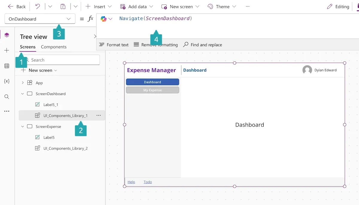
3. Handle the Event in the App
Integration in Main App
In the screenshot, the components are already being used in a screen:
-
The Header is pinned at the top with the app name and user.
-
The SideMenu is placed to the left for navigation.
-
The Footer appears at the bottom with links.
Power Apps – Project Structure & Custom Component Events
Project Structure Best Practices
To maintain a scalable and organized Power Apps solution, follow these layout and structure best practices:
🔧 Use Custom Components (Component Libraries)
-
Encapsulate shared UI elements as reusable components.
-
Ideal for: Headers, Footers, Side Menus, and Navigation Bars.
├── UI_Components_Library
│   ├── cmp_Header
│   ├── cmp_Footer
│   └── cmp_SideMenu
-
App Screens:-
ScreenDashboard-ScreenExpenseExample Components -
cmp_Header– includes labels and profile image. -
cmp_Footer– contains navigation text/buttons. -
cmp_SideMenu– houses navigation buttons like "Dashboard" and "My Expense".
✅ Benefits
-
Modularity: Clean separation of UI and logic.
-
Reusability: One component used across multiple screens.
-
Scalability: Easier maintenance and updates.

