

powerapps-variables-context-variables-and-collections


PowerApps: Variables and Context Variables
PowerApps provides different types of variables to store and manipulate data at different levels of scope within your app. The primary types of variables are:
-
Global Variables
-
Context Variables
-
Collections
In this document, we'll focus on Global Variables Context Variables and Collections.
1. Global Variables
Description
Global variables are available throughout the app and can be accessed from any screen or component.
🛠 Syntax
Set(variableName, value);
-
variableName: The name of the global variable -
value: The value you want to assign to it
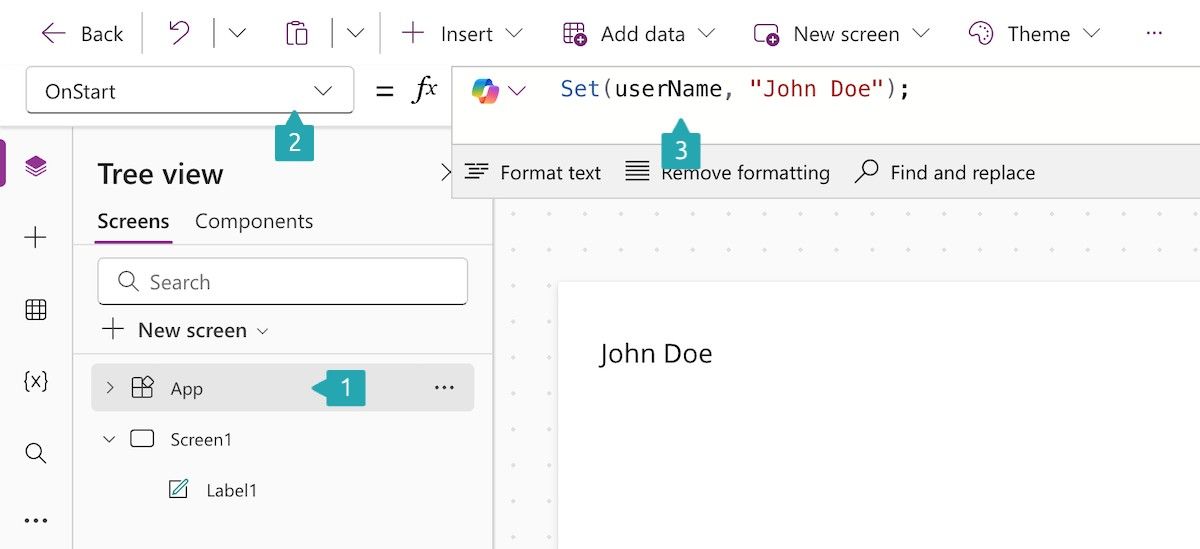
Example: Set a Global Variable
Set(userName, "John Doe");
This sets the global variable
userNameto "John Doe".
Example: Use a Global Variable
Label1.Text = userName;
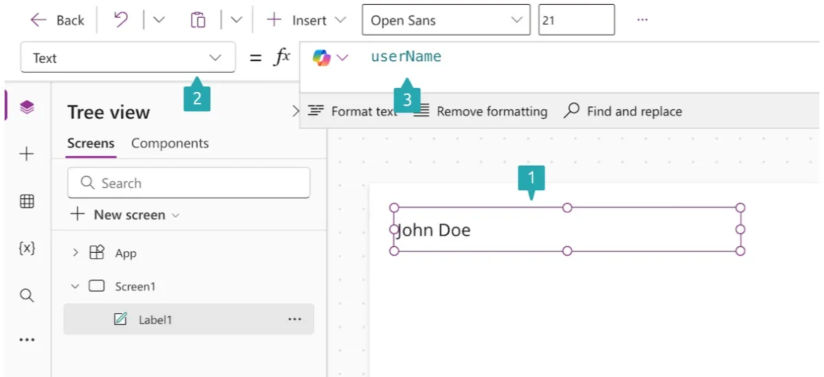
Displays the value of
userNamein a label.
✅ When to Use
-
When you need to share data across multiple screens
-
For user settings, session data, or app-wide status
2. Context Variables
Description
Context variables are local to a specific screen. They're useful when you need temporary state or screen-level configuration.
🛠 Syntax
UpdateContext({ variableName: value });
- Wrap the variable and value in curly braces
{}as it's a record.
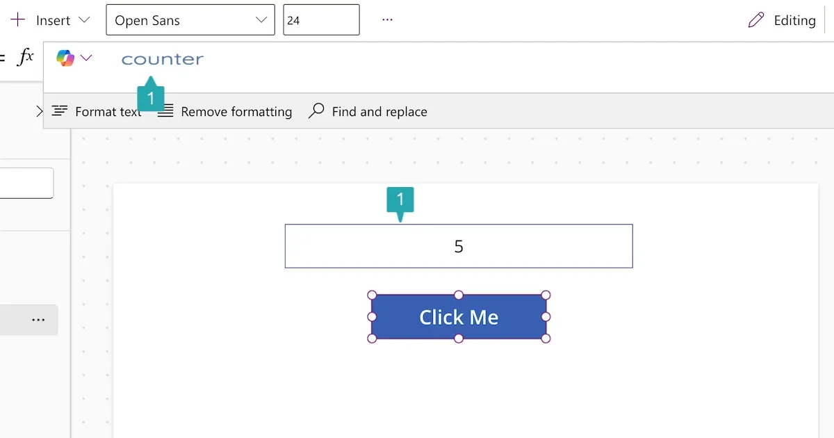
Example: Set a Context Variable
UpdateContext({ counter: 1 });
This sets the
countercontext variable to 1.
Example: Use a Context Variable
Label1.Text = counter;
Displays the value of
counteron the screen.
Example: Update Context Variable on Button Click
UpdateContext({ counter: counter + 1 });
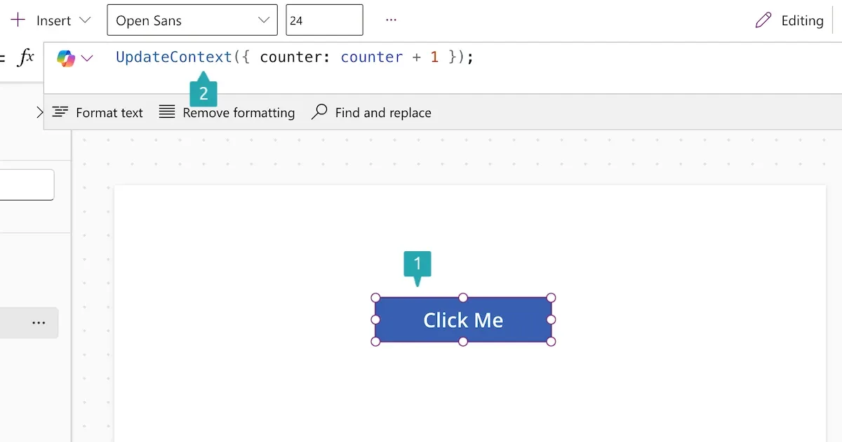
Increments the counter each time the button is clicked.
✅ When to Use
-
For temporary or screen-specific values
-
For modal dialogs or visibility toggles
-
For passing data during screen navigation
Navigating with Context Variables
You can also pass context variables during navigation using the Navigate function.
Example: Navigate and Pass Context
Navigate(Screen2, ScreenTransition.Fade, { productId: 123 });
Navigates to
Screen2and passesproductIdas a context variable.
In Screen2, you can directly use:
Label.Text = productId;
Key Differences: Global vs Context Variables
| Feature | Global Variables | Context Variables |
|---|---|---|
| Scope | App-wide | Screen-level |
| Created with | Set() |
UpdateContext() |
| Persistence | Until app is closed | Until user leaves screen |
| Usage | Shared state, user data | Temporary UI state |
Best Practices
-
Use Context Variables for screen logic and temporary state.
-
Use Global Variables for data that needs to persist across screens.
-
Use descriptive names to avoid confusion.
-
Clear variables when no longer needed:
Set(userName, Blank()); // Global
UpdateContext({ counter: Blank() }); // Context
Pro Tip: Debugging Variables
To debug variable values:
- Use a Label to display variable contents:
Label.Text = Text(counter);
- Use the Variables pane in the PowerApps editor: - Click Variables in the side panel - View Global and Context variables by screen
PowerApps Collections Guide
📘 What is a Collection in PowerApps?
A Collection in PowerApps is a temporary in-memory data table that can be used to store and manipulate data locally in an app. Unlike data from connectors (e.g., SharePoint, SQL), collections are not persisted after the app closes.
Why Use Collections?
-
Store user input temporarily
-
Group and manipulate data before saving to a data source
-
Offline data handling
-
Preload data for faster access
How to Create a Collection
Syntax
ClearCollect(CollectionName, DataSource or Records)
-
ClearCollectcreates a collection (if it doesn't exist) or clears and re-creates it. -
Collectadds new records without clearing.
Example 1: Create a Static Collection
ClearCollect(
  FruitCollection,
  { Name: "Apple", Color: "Red" },
  { Name: "Banana", Color: "Yellow" },
  { Name: "Grape", Color: "Purple" }
);
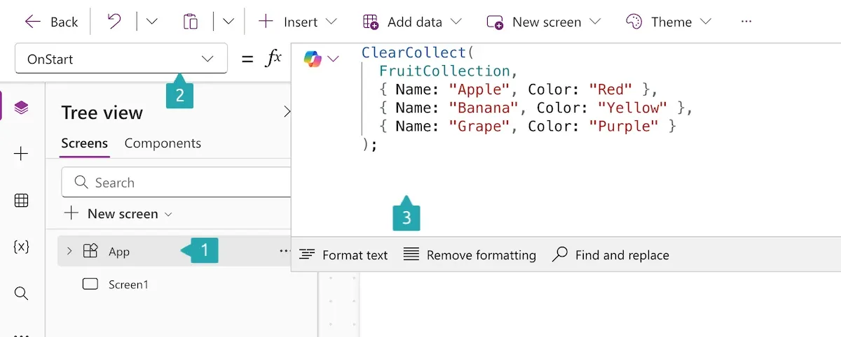
Creates a collection with fruit data.
Example 2: Create a Collection from a Data Source
ClearCollect(EmployeesCollection, Filter(Employees, (Department = "HR")));
Pulls filtered data from a data source into a local collection.
Example 3: Add a Record to an Existing Collection
Collect(FruitCollection, { Name: "Orange", Color: "Orange" });
Adds a record without clearing the existing ones.
Example 4: Remove a Record
Remove(FruitCollection, First(Filter(FruitCollection, (Name = "Banana"))));
Removes the first "Banana" from the collection.
Example 5: Clear a Collection
Clear(FruitCollection);
Removes all records.
Viewing Collection Data
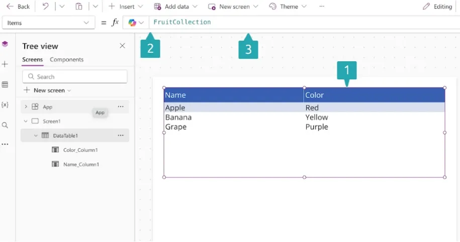
Use the Collections tab in the Variables pane in PowerApps Studio:
-
Go to File > Variables > Collections
-
Click on the collection to view its data
🧪 Looping and Manipulating Data
Example: Update a Collection's Field
UpdateIf(FruitCollection, (Name = "Apple"), { Color: "Green" });
Updates the color of Apple to Green.
Saving Collection Data
Collections are not saved unless manually written to a data source:
ForAll(
  FruitCollection,
  Patch(SharePointList, Defaults(SharePointList), { Title: Name, Color: Color })
);
Best Practices
👉 Use collections for temporary or offline storage
👉 Clear and reuse collections to reduce memory usage
👉 Avoid large collections to ensure performance
🚫 Don’t use collections as a replacement for actual data sources
Summary Table
| Function | Description |
|---|---|
ClearCollect |
Clears and then creates collection |
Collect |
Adds records to an existing collection |
Clear |
Empties all records |
Remove |
Deletes specific records |
RemoveIf |
Deletes matching records with conditions |
UpdateIf |
Updates specific records |
ForAll |
Loops through collection for operations |
Final Example
// Create a collection of tasks
ClearCollect(
  Tasks,
  { Title: "Task 1", Status: "Open" },
  { Title: "Task 2", Status: "In Progress" }
);

// Update a task
UpdateIf(Tasks, (Title = "Task 2"), { Status: "Completed" });

// Remove a task
RemoveIf(Tasks, (Title = "Task 1"));
References
PowerApps Control Properties Guide
Control properties in PowerApps determine how a control looks, behaves, and interacts with users. These properties can be static (set to a fixed value) or dynamic (based on formulas or user interaction).
✳️ Common Control Properties
| Property | Description | Example Formula |
|---|---|---|
Text |
The text shown in the control | "Welcome!" or Concatenate("Hi ", User().FullName) |
Default |
Initial value of an input control | "John Doe" or LookUp(Users, ID = 1, Name) |
Visible |
Whether control is visible | true or Slider1.Value > 50 |
DisplayMode |
Whether control is editable, view-only, or disabled | DisplayMode.Edit, DisplayMode.View |
Fill |
Background color of control | Color.LightBlue or If(Value>10, Red, Green) |
BorderColor |
Border color | Color.Black or If(IsSelected, Blue, Gray) |
OnSelect |
Runs a formula when control is clicked/tapped | Navigate(Screen2) |
Tooltip |
Shows text when user hovers | "Click to submit the form" |
Size |
Font size | 16 |
Color |
Text color | Color.White or If(Condition, Red, Black) |
Width / Height |
Dimensions of the control | Width = 200, Height = 40 |
Examples by Control Type
🗾 Label
Properties Used:
-
Text -
Color -
Font -
Visible
Label1.Text = "Hello, " & User().FullName;
Label1.Color = If(Hour(Now()) > 18, Color.White, Color.Black);
Label1.Visible = Checkbox1.Value;
🔲 Text Input
Properties Used:
-
Default -
HintText -
OnChange -
BorderColor
TextInput1.Default = "Enter your name";
TextInput1.HintText = "e.g. Jane Doe";
TextInput1.OnChange = Set(UserName, TextInput1.Text);
TextInput1.BorderColor = If(IsBlank(TextInput1.Text), Color.Red, Color.Gray);
🔳 Button
Properties Used:
-
Text -
OnSelect -
DisplayMode -
Fill
Button1.Text = "Submit";
Button1.OnSelect = SubmitForm(EditForm1);
Button1.DisplayMode = If(
  IsBlank(TextInput1.Text),
  DisplayMode.Disabled,
  DisplayMode.Edit
);
Button1.Fill = If(
  (Button1.DisplayMode = DisplayMode.Disabled),
  Color.Gray,
  Color.Green
);
📟 Dropdown
Properties Used:
-
Items -
Default -
OnChange
Dropdown1.Items = ["Low", "Medium", "High"];
Dropdown1.Default = "Medium";
Dropdown1.OnChange = Set(PriorityLevel, Dropdown1.Selected.Value);
✅ Checkbox
Properties Used:
-
Default -
Text -
OnCheck/OnUncheck
Checkbox1.Text = "I agree to the terms";
Checkbox1.Default = false;
Checkbox1.OnCheck = UpdateContext({ Agreed: true });
Checkbox1.OnUncheck = UpdateContext({ Agreed: false });
📅 Date Picker
Properties Used:
-
DefaultDate -
MinDate/MaxDate -
OnChange
DatePicker1.DefaultDate = Today();
DatePicker1.MinDate = DateAdd(Today(), -30);
DatePicker1.MaxDate = DateAdd(Today(), 30);
DatePicker1.OnChange = Set(SelectedDate, DatePicker1.SelectedDate);
🔀 Dynamic Behavior Example
Disable a submit button until form is complete:
ButtonSubmit.DisplayMode = If(
  IsBlank(TextInput1.Text) || !Checkbox1.Value,
  DisplayMode.Disabled,
  DisplayMode.Edit
);
📌 Tip: Naming Controls
Use meaningful names like txtName, btnSubmit, lblGreeting to improve readability and maintainability.

